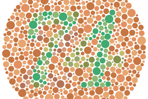
After many Website Accessibility Audits, we’ve learned that one of the most common issues with website accessibility is related to contract. It’s crucial to understand the importance of contrast when designing and developing a website. Contrast is the difference between two elements on a web page, such as text and background color, which makes them distinguishable from each other. A website’s contrast directly impacts its accessibility, and therefore, it’s usability. Users with visual impairments, color blindness, or low vision, rely on sufficient contrast to navigate a website with ease.
Contrast plays a critical role in ensuring that web content is legible, scannable, and perceivable. It is a fundamental principle of accessibility and is essential to consider when designing and developing websites. When a website has a low contrast ratio, users may have difficulty reading and comprehending the content, which can lead to frustration and confusion. Additionally, a low contrast ratio can cause eye strain, headaches, and migraines for users.
Fortunately, there are several ways to increase the contrast of a website. One potential solution is to incorporate software functions that allow for contrast adjustments. AllAccessible, for example, offers seven different contrast functions to make web pages more accessible to users with visual impairments.
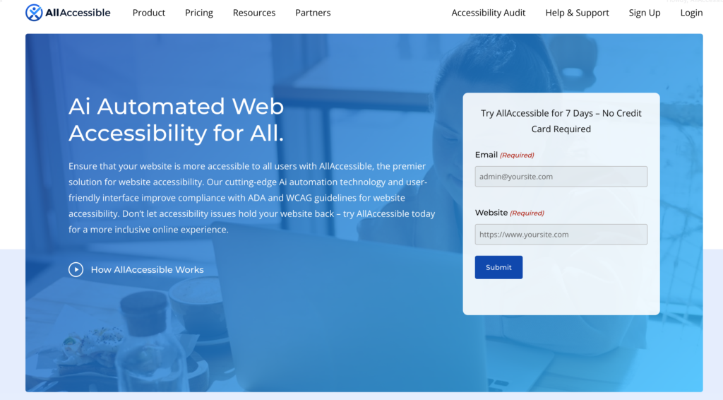
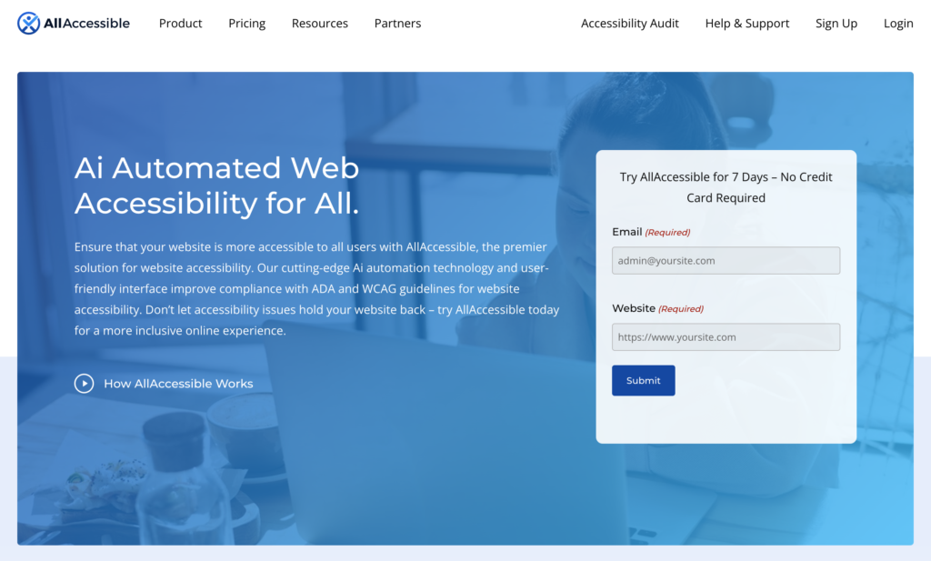
Let’s explore how these modes change the website’s appearance to benefit the user. First, let’s start with a standard view of our homepage banner area – unedited. Then we will apply the contrast modes and provide screenshots to show how the mode affects the layout.
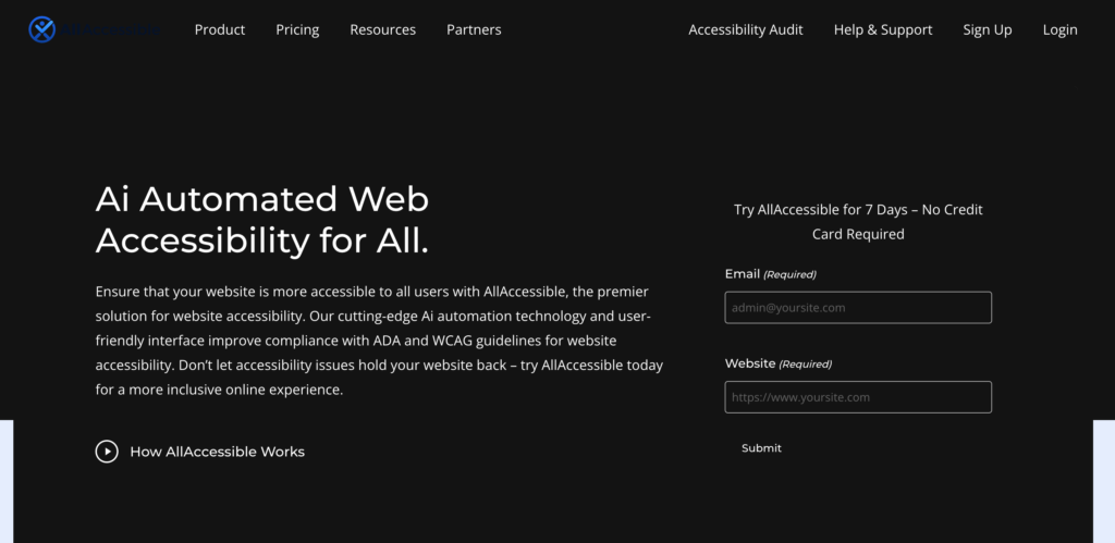
Dark Contrast Mode
This mode changes the background color of the website to black and the text to white, which makes it easier for users to read. This function is particularly useful for users who are sensitive to bright light or have difficulty reading text on a white background.
Invert Colors Mode
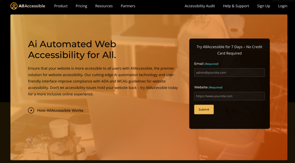
Another contrast function that our software provides is Invert Colors. This function inverts the colors of all elements on the page, which can be helpful for users who prefer high-contrast designs or have difficulty distinguishing between certain colors.
Light Contrast Mode
Light Contrast is another function that our software offers. This function changes the background color of the website to white and the fonts to black, making it easier for users to read content on a website.
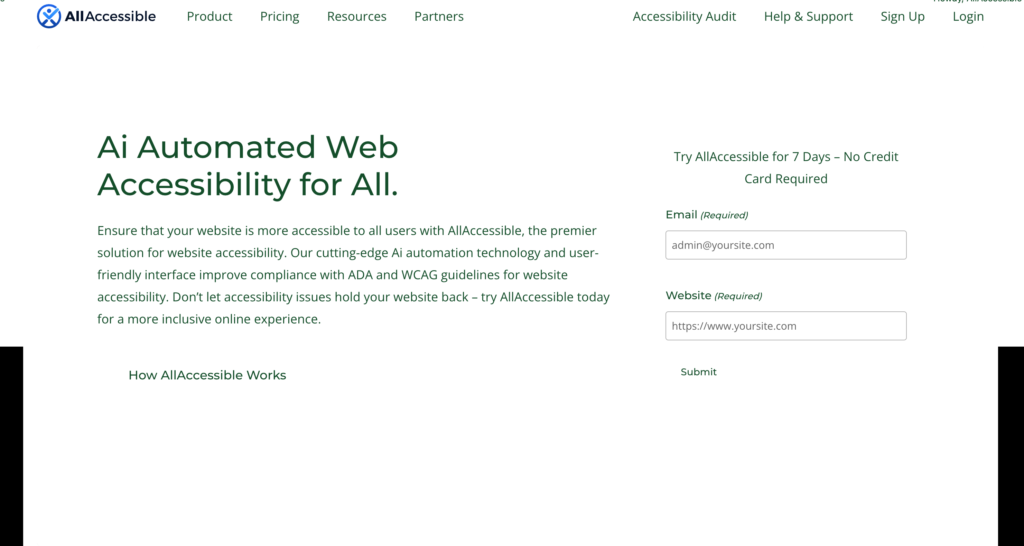
Monochrome (Black and White) Mode
Monochrome is another function that removes all color from the page, creating a black and white appearance for all elements. This function is useful for users with color blindness who may have difficulty distinguishing between certain colors.
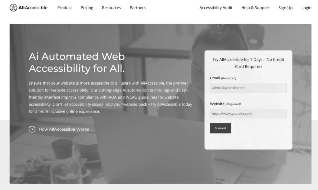
High Contrast Mode
High Contrast is a function that increases the contrast level of all elements on a website, making it easier for users with visual impairments to read and comprehend the content.
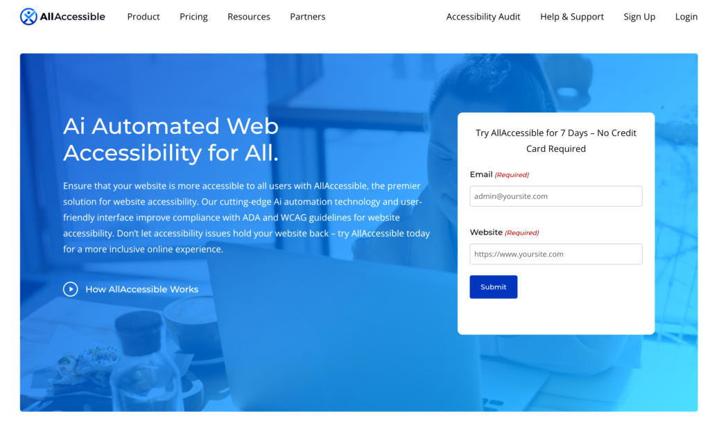
High Saturation Mode
High Saturation is a function that increases all color saturation on the website, making it easier for users to distinguish between different elements on the page.
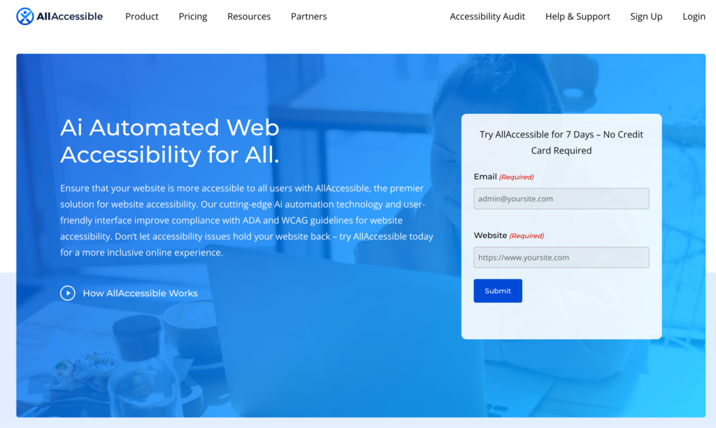
Low Saturation Mode
Low Saturation is a function that decreases the color saturation on the page, which can be useful for users with color sensitivities or who prefer low-color designs.
Incorporating these contrast adjustment functions into website design and development is essential for ensuring accessibility for all users. However, it’s important to note that contrast is not the only factor that affects website accessibility. Other factors such as font size, text spacing, and navigation design also play a significant role in ensuring a website’s accessibility.
In conclusion, contrast is a critical element in website accessibility, and it’s essential to consider it when designing and developing a website. Low contrast ratios can make it difficult for users to read and comprehend content, leading to frustration and confusion. However, incorporating software functions that allow for contrast adjustments, such as our software’s seven different contrast functions, can make a significant difference in ensuring that web content is perceivable and scannable. As an industry leader in website accessibility, it’s our responsibility to prioritize the needs of all users and ensure that our websites are accessible to everyone, regardless of their abilities or disabilities.
